rturf 10: summarising by group, and chart facets
In the last episode, I showed how R packages—also called libraries—can be loaded into the working environment. These packages contain useful functions. One that I use all the time is the summarise function in the dplyr package. I’ll explain how I use that function below. But first, a quick review.
What I’ve done so far in this project is read in some files of ball roll distance and clipping volume, write a function to calculate the ball roll distance in feet, made an adjustment with the ifelse function to double the stimpmeter measurement if the 2x notch was used, and made a couple plots of the data.
# load packages
library(ggplot2)
library(cowplot)
theme_set(theme_cowplot())
# read in the KPMG data file
d <- read.csv("data/kpmg_speed_vol_2019.csv",
header = TRUE, stringsAsFactors = FALSE)
# function to calculate green speed by Brede equation, input is in inches
brede <- function(a, b) {
speed <- (2 * a * b) / (a + b) / 12
return(speed)
}
# calculate green speed
d$speed <- brede(d$uphill, d$downhill)
# adjust ball roll distance by 1x or 2x notch used on the stimpmeter
d$speed1 <- ifelse(d$x1x2 == 2, d$speed * 2, d$speed)
# read in the clipping volume data
vol <- read.csv("data/hngc_1906_clipvol.csv",
header = TRUE, stringsAsFactors = FALSE)
# make the practice putting green identifying names consistent
vol$hole <- ifelse(vol$hole == "small", "sp",
ifelse(vol$hole == "big", "bp2",
vol$hole))
# merge the speed and volume data to one data frame
forPlot <- merge(d, vol)
forPlot$date <- as.Date(forPlot$date)
forPlot$dateFac <- as.factor(forPlot$date)
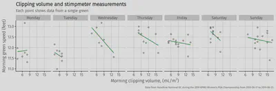
# make a plot of clipping volume and green speed, all combined
p <- ggplot(data = forPlot, aes(x = vol, y = speed1))
p + background_grid() +
geom_point() +
geom_smooth(method = 'lm', se = FALSE)
## `geom_smooth()` using formula 'y ~ x'
That plot above makes it look like there is nothing happening with green speed across the full range of clipping volume that week. But from previous experience, and logic, I expect that the ball will roll a shorter distance when the grass is growing more. I don’t know that with the subtle differences in both clipping volume between greens, and differences in stimpmeter measurements between greens, if that effect can actually be measured. But throwing all the data together into one chart is hiding any correlation.
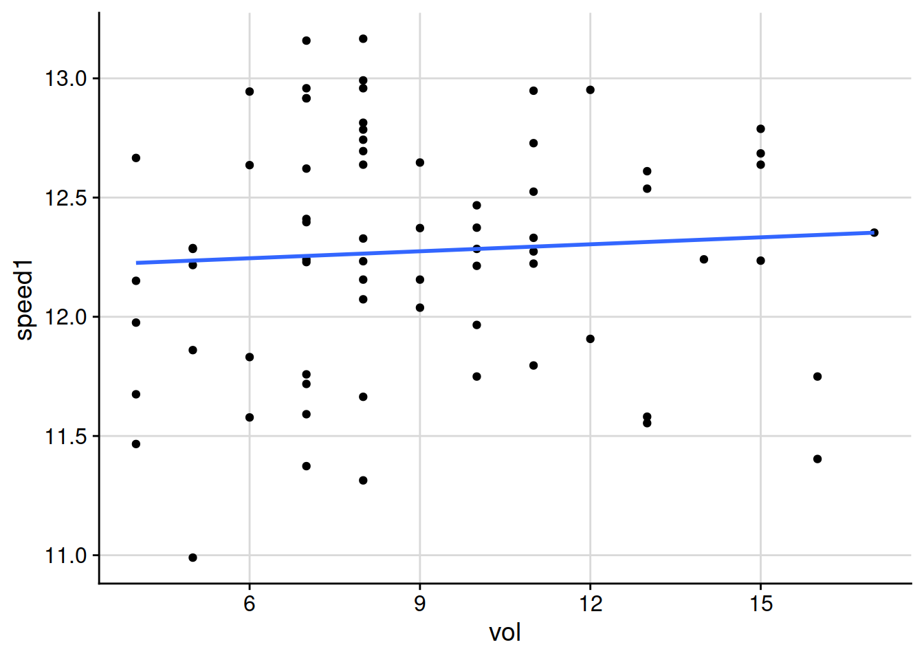
I can adjust how I show the same data on the chart. I can let the software calculate a regression line for each date. I do that by adding an aesthetic argument to the geom_smooth, saying with the line aes(colour = dateFac)) that the aesthetic for colour of the regression lines plotted on the chart should be different colours based on the dateFac variable, which is the date the measurements were made, formatted as a factor. And then the chart looks like this.
# make a plot of the clipvol and green speed
p <- ggplot(data = forPlot, aes(x = vol, y = speed1))
p + background_grid() +
  geom_point() +
  geom_smooth(method = 'lm', se = FALSE,
              aes(colour = dateFac))
## `geom_smooth()` using formula 'y ~ x'
That’s not very pretty, but it suddenly looks really interesting. Those lines are going down almost every day.^[Of course there is a lot of variability. Clipping volume on its own doesn’t completely explain the green speed. But that’s not what I’m trying to find out. The two things I want to find out are if there is a relationship that can be detected and that I can say with some confidence that “clipping volume does have a measurable influence on green speed.” The second thing I want to find out is if there is such a relationship, in which direction does it go. Does more clipping volume go along with faster green speeds, or with slower green speeds?] There seems to be something going on. When the clipping volume on a green is higher, the stimpmeter measurement seems to be somewhat slower. Before I do anything more to adjust how that chart looks, I want to show a summarise function that I use frequently.
A summary by group
This is a function in the dplyr package.
# load the dplyr package
library(dplyr)


# calculate the mean clipvol and mean stimpmeter by day
daily_means <- forPlot %>%
  group_by(date) %>%
  summarise(meanVol = mean(vol),
            meanStimp = mean(speed1))
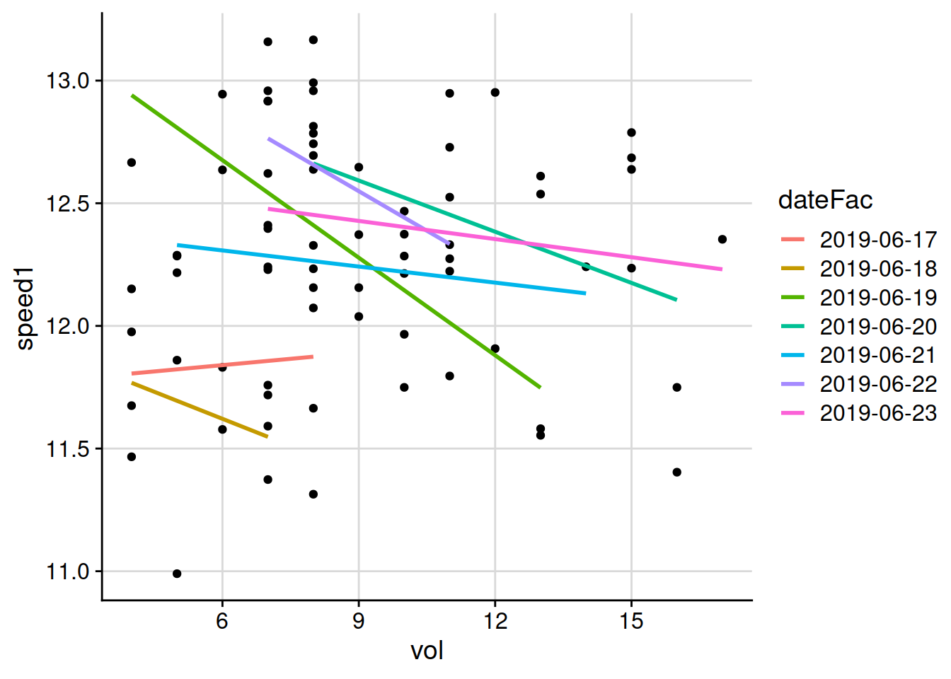
I’ve used the pipe syntax and the %>% operator to do this. The code above creates a new tibble called daily_means, which is like a data frame, in the R working environment. It takes as input the data frame called forPlot, groups it by date, and then for each date it calculates the mean volume and the mean speed and puts those in columns that I’ve called meanVol and meanStimp.
I can print this tibble and it should have mean values for each of the dates during the tournament week.
daily_means
## # A tibble: 7 x 3
##   date       meanVol meanStimp
##   <date>       <dbl>     <dbl>
## 1 2019-06-17    6.29      11.8
## 2 2019-06-18    5.62      11.6
## 3 2019-06-19    7.86      12.4
## 4 2019-06-20   10.7       12.5
## 5 2019-06-21    8.64      12.2
## 6 2019-06-22    8.25      12.6
## 7 2019-06-23   12.4       12.3
I use that syntax all the time to make summary calculations.
Adjusting the chart
I want to make some adjustments to the chart.
In this case I think I’d like to show the data from each of those seven days in its own frame. The
ggplot2package has afacetfunction that does this automatically. I think this might be interesting as a wide chart, kind of like a ribbon, going from Monday on the left to Sunday on the right.I’m also going to adjust the text on the axis labels and the title and add a caption.
I’ll change a few colors and shapes, and will adjust the font size of the caption to be a bit smaller than the default
I’m going to get the weekdays and plot to show that rather than the calendar date. I think it will look better that way.
I’m going to change the font for the chart
forPlot$day_of_week <- as.factor(weekdays(forPlot$date, abbreviate = FALSE))

forPlot$day_of_week <- ordered(forPlot$day_of_week, levels=c("Monday", "Tuesday", "Wednesday", "Thursday",
"Friday", "Saturday", "Sunday"))

p <- ggplot(data = forPlot, aes(x = vol, y = speed1))
chart3 <- p + theme_cowplot(font_family = "Fira Sans Light") +
  background_grid() +
  geom_smooth(method = 'lm', se = FALSE, colour = "#31a354") +
  geom_point(shape = 1) +
  facet_wrap(~day_of_week, nrow = 1) +
  labs(x = expression(paste("Morning clipping volume, (mL/", m^{2}, ")")),
       y = "Morning green speed (feet)",
       title = "Clipping volume and stimpmeter measurements",
       subtitle = "Each point shows data from a single green",
       caption = "Data from Hazeltine National GC during the 2019 KPMG Women's PGA Championship from 2019-06-17 to 2019-06-23.") +
  theme(plot.caption = element_text(size = 8))

chart3
## `geom_smooth()` using formula 'y ~ x'
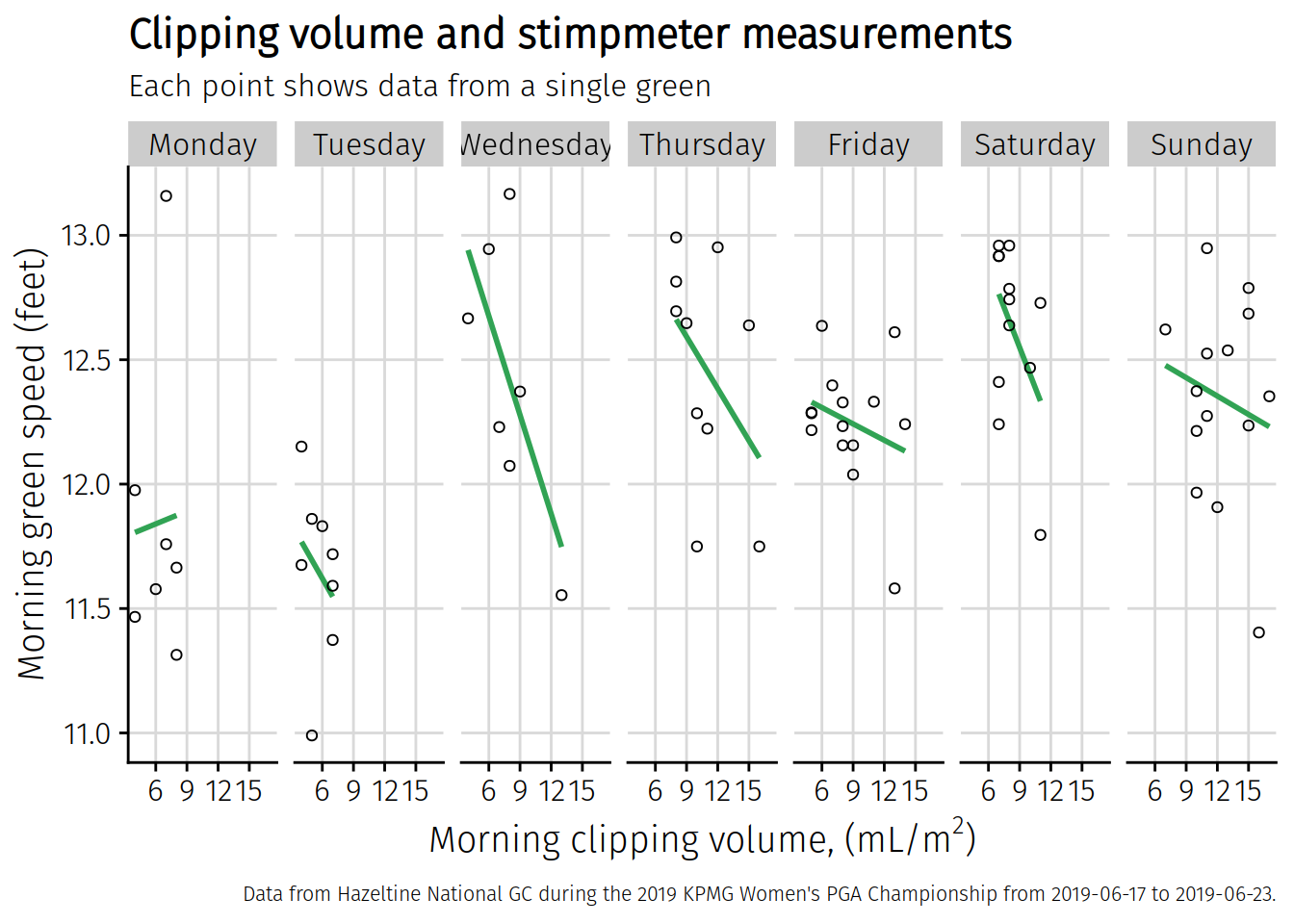
There’s the plot, which looks a little cleaner to me. I’ll save it now to my Desktop with the save_plot function from the cowplot package. I’ve put this chart in an object called chart3. That’s what I want to save. This is going to be a little bigger than I want, but I can resize it later outside of R. I’m going to save it 3 times wider than it is high, and I think this will look better for sharing.
save_plot("~/Desktop/weekly_chart_faceted.png", chart3, base_height = 4, base_width = 12)
## `geom_smooth()` using formula 'y ~ x'
That plot I saved looks like this.